Burger King Rebrands and McDonalds’ New Packaging
Burger King and McDonald’s are locked in an eternal battle for market share in the fast-food, burger-and-fries industry. Earlier this year, both released dramatic new looks at key parts of their global visual identity.
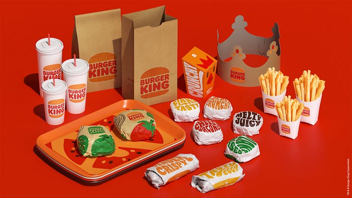
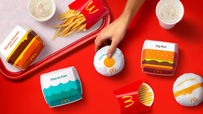
Burger King has fully rebranded, with a new logo and design style that nips and tucks their original logo in a fresh, vibrant, and engaging new design language. McDonald’s, meanwhile, have introduced new global packaging that also leans into a fresh, bold, colourful direction. Let’s take a look at what’s going on in both.
Burger King Rebrands
This is Burger King’s first rebrand in 20 years, since they introduced the blue swoosh and stylized burger in the late 1990s. Jones Knowles Ritchie are the design agency responsible for the work.

Their new brand ties directly back to their original logo from the 1960s to the late 1990s, cleaning up the lettering and design sensibility. It’s a wonderful, engaging, and fun brand that leans heavily into 1970s-esque fonts and colours, with spirited used of lettering and typography. While there is some photography, these initial design panels lean heavily into illustrations as well — a clear break from the photo-realistic advertising space of, well, most of the world, most of the time.

The best part? This BK favicon/illustration — a once-in-a-career “holy shit” moment that I’m sure caused shivers up the spine of the design team when it first got comped up.

McDonalds’ New Packaging
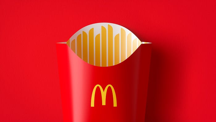
McDonald’s is still retaining its usual logo, for one blindingly clear reason: those golden arches are amongst the most recognizable brand assets of all time, so they’re certainly not going anywhere anytime soon. But that hasn’t stopped Pearlfisher from creating a fun, graphic new approach to their food packaging around the world.

The new packaging uses bold, graphic, non-completely-literal-but-still-representative graphics. It’s a fun departure from the norm and from their previous packaging, spiritually similar to the same colourful, bright, vibrant direction that Burger King went with.

And while this work isn’t directly related, it does tie into some brand advertising work for McDonald’s in recent years.

What’s Common to Both
That both Burger King and McDonald’s have released new design languages and brand elements within a month and a half of each other is a hell of a coincidence. While both have their differences, there are a few noteworthy things in common:
- Both make use of a bold use of strong, vivid colours that suits the fast-food space
- Both lean heavily into their owned assets — Big Macs, BK, the McDonald’s M, etc
- Both feature specific, intentional ties back to their previous brand’s heritage
- Both generally aims for brand familiarity — and perhaps a smile
- For lack of a better word, both are simply fun
Over to you, Wendy’s!
—
FURTHER READING
https://www.underconsideration.com/brandnew/archives/new_packaging_for_mcdonalds_by_pearlfisher.php
https://www.dezeen.com/2021/01/12/burger-king-rebrand-retro-logo/
–
Stuart Thursby is the Founder and Creative Director of the digital creative agency Stack Creative.
